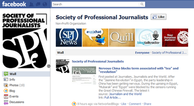
After I switched the Society of Professional Journalists fan page to the upgrades, it sparked the idea to use this latest version as an opportunity to have some fun while creating a new Facebook branding strategy for SPJ. A week later, we’ve now converted the photos displayed on our fan page as promotional space to showcase various programs provided by SPJ.

As you can see above, the first set of promotions feature SPJ’s additional communications vehicles so we can better help our members and followers stay connected with what SPJ is doing in the journalism profession. Once clicked on, the description for each image provides a brief overview of that topic and additional links to those resources. In the coming months these placements will cycle and alternate with other themed placements to help SPJ’s Facebook fans with awareness of other programs such as our professional development, ethics and FOI resources.
Of course there are some limitations to this new strategy that brands will encounter. Unlike some of the creative ideas that have been spawned by their profile page alter egos, fan pages’ photos are continuously randomized and do not maintain a specific order of placement. Given the 25 possible screen display outcomes, this specifically prevents any synchronized efforts to create one consistent, single promotion that spans across all five spaces.
 Another constraint I tweeted about with Washington Post Live intern and Media Bistro 10,000 Words blogger Kevin Loker concerned what happens next when an image is clicked. Images that are larger in scale than the exact size displayed on a fan page’s main wall will create an off-centered image when viewed on the wall. However, not enlarging the image means that it will remain that smaller size once it is clicked on. Deciding how to proceed given both constraints largely depends on personal preference.
As Facebook makes further advances, these factors will hopefully be taken into account and these problems may dissolve themselves over time. Until then, we are not the only ones who aren’t letting that stop us from experimenting. Kevin tagged me in on another conversation where USA Today College also had some fun with the new upgrades this past Friday.

When using these types of promotions for fan pages it is important to do so ethically and legally. Be familiar with the Facebook Advertising Guidelines.
Want to know more about the process that went into creating SPJ’s new Facebook promotions? Read a more in-depth entry by following this link to the SPJ headquarters blog where you can learn about the behind the scenes perspectives that went into this project - the ideas, failed concept work and a sneak peek at our next series of promotions.


3 comments:
Here is my use of the pictures stream, I used it both on my personal business page and my main client's page:
http://www.facebook.com/pages/Jeff-Pemberton/151708164885741
www.facebook.com/RossMedical
Thought you might be interested!
@JeffPemberton
Nice! Thanks for posting them Jeff. It's great to see where others are getting creative with the new design. I like the clever styling you chose as well.
The information for the facebook promotion ideas which is really helpful and informative to know. Thank you so much. kovai e solutions | kovai web solutions
Post a Comment